Spring Conference Roundup
March 25, 2015
A Road Safety Challenge for a New Government?
May 26, 2015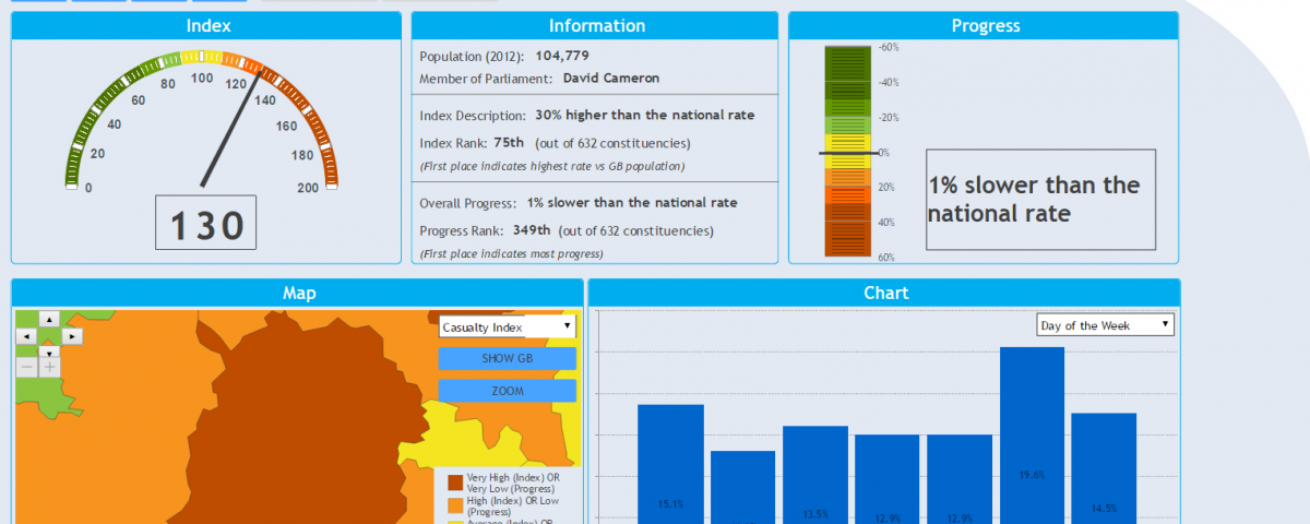
Constituency Road Safety Dashboard Launched
Today sees the launch of a comprehensive road safety comparison tool that allows members of the public and MPs to review road casualties based on the constituency in which they live. This ambitious project has been a year in development and was made possible through the support of Direct Line Group. The analysis, dashboard and reports were all undertaken and created by Road Safety Analysis.

In 2012 and 2013 we published our own ‘state of the nation’ analyses that reviewed risk and progress based on local authority districts for residency, and highway authorities for roads. We discovered that both measured are valid to an extent, but that road risk by vehicle miles wasn’t a satisfactory measure for national comparison as the relationship between traffic and casualties wasn’t linear.
These pieces of work in turn led to the creation of our bespoke Highway Authority Network Classification System (HANCS) which groups similar authorities based on network density. By matching authorities that have similar road networks it’s enables a much more relevant set of comparisons to be made.
We have been working with PACTS for many months to bring the residency analysis forward in more detail and to use a new geography, namely parliamentary constituencies. In order to do this we have to go back to the start with the data and match the postcodes of casualties to the relevant constituency – a feature present in MAST for a little over a year.
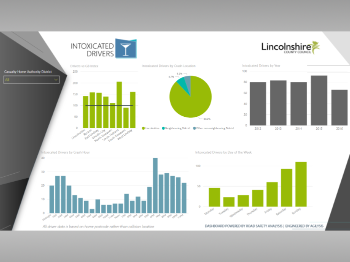
Our analysis involved the creation of separate indexes for motorcycle users, pedestrians and several other groups. Once we had crunched all of the data we fed it in to our new data visualisation system and created a free-to-view dashboard, published via the PACTS website. Users can choose a constituency, review the index, progress, casualty profiles, and filter by age or road user type.
As well as the interactive dashboard, 632 separate reports were created that summarised the local picture and how constituency residents compare to the rest of the country. Every one of these is unique with different patterns of casualty distribution and should offer a real insight to MPs, either on the campaign trail or when they are elected this May.
It is worth re-stating that this analysis does not tell you about ‘dangerous roads’ or ‘accident blackspots’. These terms are used by the press and have nothing to do with our work which looks at where people are from. Interestingly we looked at the relationship between casualty home and crash location found that on average, 50% of residents are injured locally (within their constituency) and 50% outside. This varies dramatically with 95% injured locally in Orkney and Shetland compared to only 25% in Dulwich and West Norwood.
To wrap everything up we worked with PACTS on a summary report that looked at geographical patterns and distributions to attempt to understand if there are specific trends occurring around the country. We did find a few interesting patterns, as you can see on the map below, but if anything they raise as many questions as answers.
With the demise of the short-lived DfT English Authority Road Safety Comparison Site, it is good to see that efforts are being made by NGOs to try to understand ‘performance’ and this focus on residents will hopefully highlight the challenges many communities face. We hope to expand the analysis in the future and welcome feedback via twitter or email.