
This guide will act as your whistle stop tour around the new MAST Dashboard.
Navigation Bar:
Along the top of the screen is a navigation bar, which has 4 icons in the right-hand corner, as shown here:
![]()
Export enables the user to export the dashboard screen or elements of the dashboard in a selection of formats including Excel, CSV and PNG. Clicking on the Export icon brings up the window shown below. The pane on the right hand side shows the current dashboard view. On the left hand side is a list of the controls on the dashboard. To the top left is a drop down list allowing the format in which data is to be exported to be changed. The default is Excel. When exporting in Excel format it is possible to select one or many charts/visualisations to export as data tables. By checking the button next to ‘Export entire dashboard’ it is also possible to export the data from the entire dashboard as shown by the red rectangle around the page on the right hand side. There are also a set of advanced options available by selecting the ‘Advanced’ button to the lower right of the window. When exporting in csv format it is only possible to export data from one visualisation from the dashboard. When exporting as a png image it is possible to export either a single visualisation or the entire dashboard.

Print opens a new window allowing the user to print the current dashboard.
Clicking on the share icon provides links to the dashboard which can be shared with others. The links are for the Silverlight application, a HTML viewer version and the HTML explorer version.
The logout button logs the user out of the dashboard. However, this is unnecessary as logging in to MAST dashboard doesn’t currently require a username and password. If you accidentally logout of the dashboard simply refresh the page and it will take you back to the dashboard.
On each page there are also a set of buttons and filters across the top:
![]()
The highlighted button is the currently selected page, in this case ‘When’. Clicking on another button will navigate to the corresponding page. The geographical area can be changed by clicking on the button labelled ‘Select Location(s)’ in the Silverlight version or ‘(All)’ in the HTML version. Geographies from ‘region’ down to ‘local authority district’ can be selected and it is possible to select multiple locations. It is also possible to filter the data by year using the button labelled ‘Select Year(s)’ in Silverlight or ‘All values’ in HTML. By default, all years (2004 to 2013) are selected. Selected locations and years will be retained when navigating to another page.
In the top left corner of the dashboard are two radio buttons labelled ‘Pedestrian Casualties From’ and ‘Pedestrian Casualties In’.
- ‘Pedestrian Casualties From’ shows resident casualties of the selected location(s).
- ‘Pedestrian Casualties In’ shows casualties injured on the roads of the selected location(s).
The 'Who' dashboard
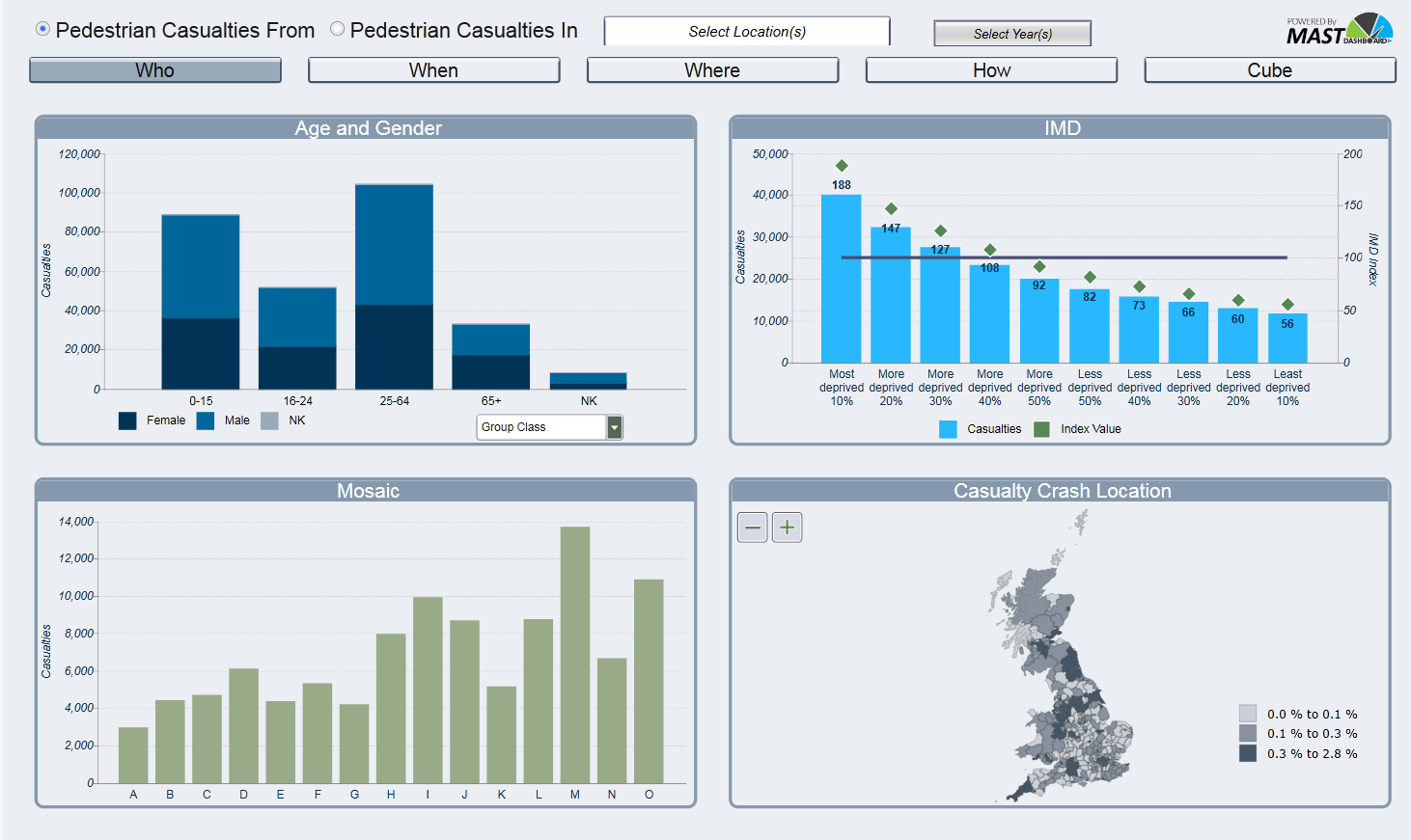
This dashboard shows information about the pedestrian casualties themselves such as: age; gender; IMD; Mosaic Group; and crash/home location.
In the top left, the chart shows the number of casualties by age and gender. Initially the x-axis shows 5 age groups (0-15; 16-24; 25-64; 65+; and NK), as shown above. The drop down box below the axis allows the age groups to be changed to either 10 year age bands or 5 year age bands.
In the bottom left is a chart showing the Experian Mosaic Group of the pedestrian casualty. This shows numbers of pedestrian casualties from each Mosaic Group from the selected location(s).
The chart in the top right shows pedestrian casualties by Index of Multiple Deprivation (IMD). This shows numbers of pedestrian casualties by the IMD of the lower layer super output area (LSOA) that they live in. It also shows a 100-based index value which shows numbers of casualties relative to the population of the LSOA in which they live. An index value of 100 means that casualty numbers are as expected given the population from that IMD living in the selected location(s). A value of 150 means casualties are 50% above the level expected based on population. A value of 75 means that casualties are 25% below the expected level based on population.
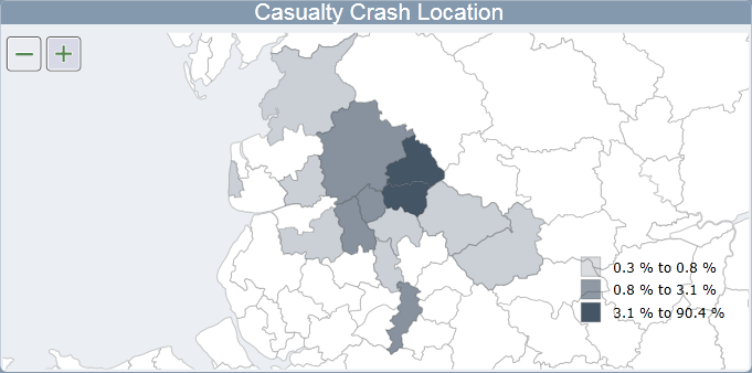
In the bottom right of the page is a map showing the locations where the pedestrian casualties were injured. The map shows where the casualties who live in the filtered area(s) are involved in crashes. The numbers of casualties crashing in each local authority district are expressed as a percentage of all casualties from the filtered area(s). It is possible to zoom in to locations using the plus and minus buttons to the top left of the map. It is also possible to scroll by holding down the left mouse button and moving it in the direction you would like to scroll. Shown below is a zoomed-in map where the district of Burnley has been selected. It shows the locations where Burnley’s resident pedestrian casualties were injured and that there were two districts where over 3.1% of Burnley’s resident pedestrian casualties were injured including Burnley itself (90.4%).
Selecting the ‘Pedestrian Casualties In’ radio button changes the layout of the dashboard. As IMD and Mosaic are not relevant for casualties involved in crashes in an area these charts have been removed and the other 2 charts expanded as shown below. The map now shows the home location of casualties injured in the selected location(s). The percentage is calculated from all known home locations. The selected filters for location, crash year and age group will remain when choosing ‘Pedestrian Casualties In’.

The 'When' dashboard
The ‘when’ dashboard consists of 4 charts relating to the date the pedestrian was injured. There are charts showing pedestrian casualty numbers by year; month; day of the week; and hour.
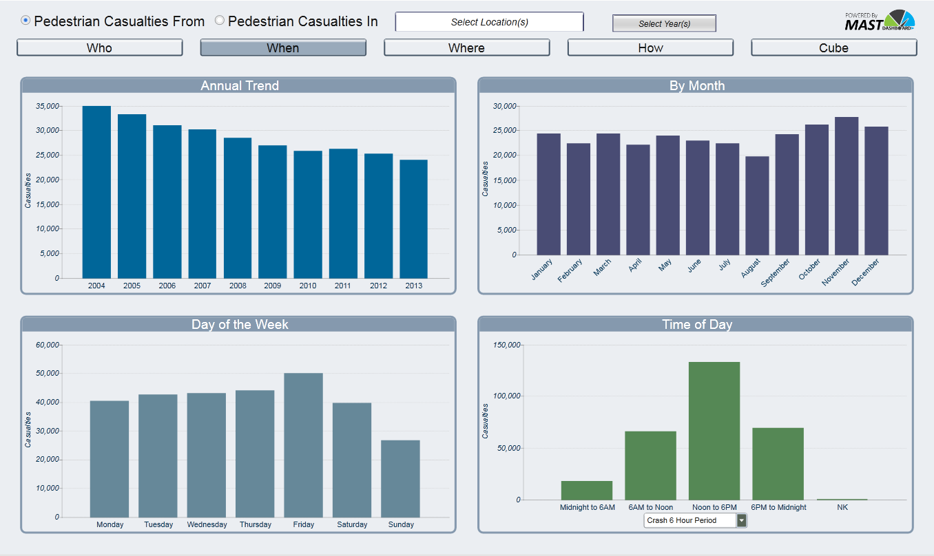
The ‘Time of Day’ chart has a drop down list underneath the x-axis. This allows the crash hour groupings to be changed from the default 6-hour periods to 3-hour periods or individual crash hour. Selecting ‘Pedestrian Casualties In’ shows the same four charts but with data relating to casualties injured in crashes in the filtered location(s).
The 'Where' dashboard
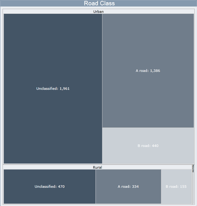
This page focuses on the location of the pedestrian at the time of the crash. There are 3 visualisations here: Pedestrian Location; Pedestrian Movement; and Road Class.

Pedestrian Location shows numbers of casualties by the location of the pedestrian, e.g. on a crossing, within 50m of a crossing and in carriageway, not crossing. Pedestrian Movement shows numbers of casualties by the STATS19 recorded movement of the pedestrian. Road Class is shown on a tree map. The larger the area and the darker the colour of the road class polygon the more pedestrian casualties were injured on that class of road. For example, the image below shows the tree map for Kent County. It is split in to ‘Urban’ and ‘Rural’ and both of these are further split in to unclassified road, A road and B road. Selecting ‘Pedestrian Casualties In’ shows the same visualisations but with data relating to casualties injured in crashes in the filtered location(s).
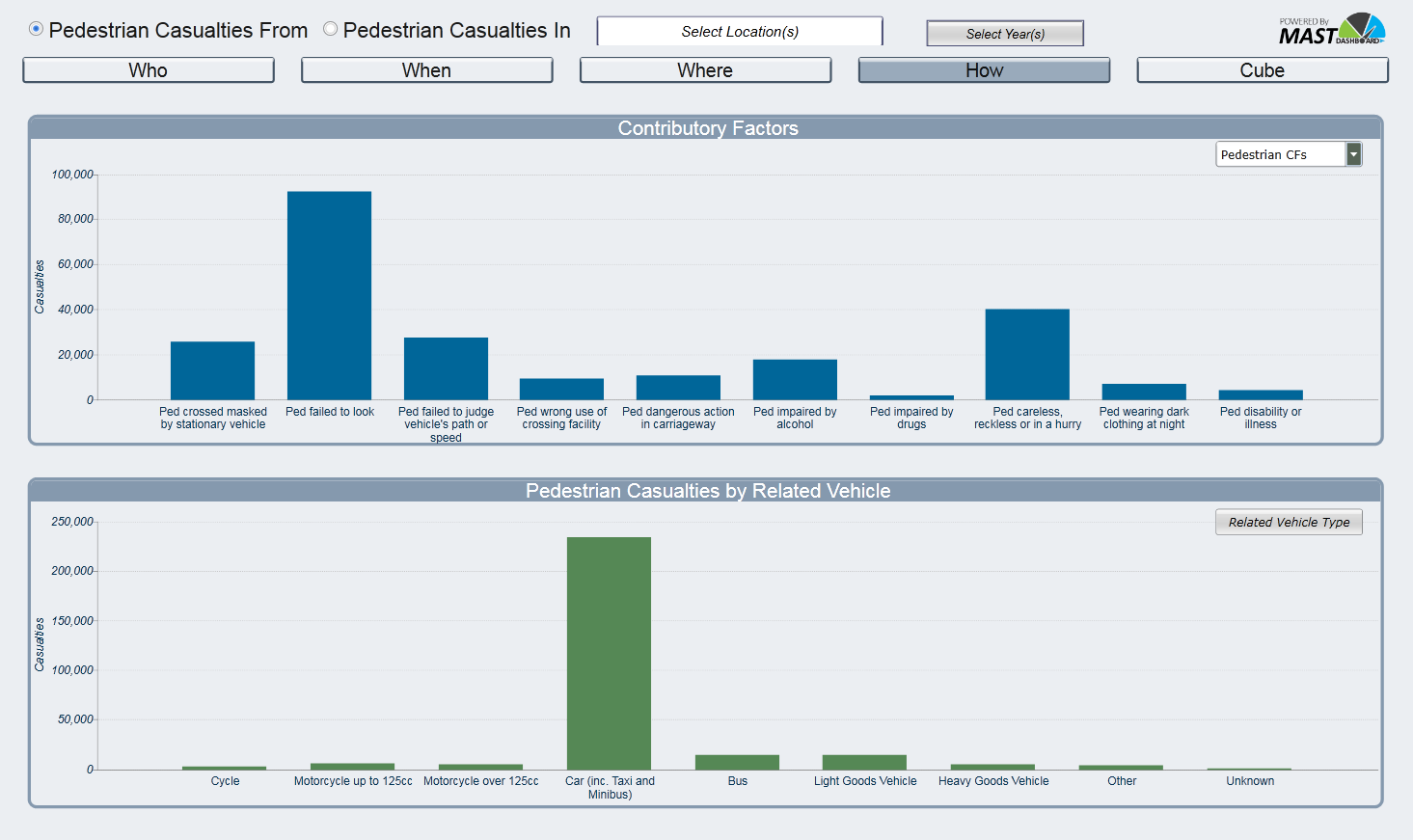
The 'How' dashboard
There are 2 charts on the ‘how’ page. The top chart shows pedestrian only contributory factors (CFs) or grouped CFs for the vehicle involved in the crash with the pedestrian. This can be changed using the dropdown list to the top right of the chart. Pedestrian CFs are the CFs attributed to the pedestrian. Crash Involved CFs are those attributed to the vehicle that was involved in the crash with the pedestrian.
The second chart shows the number of pedestrian casualties by the vehicle they were involved in a crash with. As the majority of vehicles were cars there is a drop-down list to the right corner of the chart which allows some vehicle types to be omitted in order to focus on particular vehicle types.
The 'cube'
Unfortunately, cube data isn’t currently available in the HTML version and is only accessible in Silverlight.
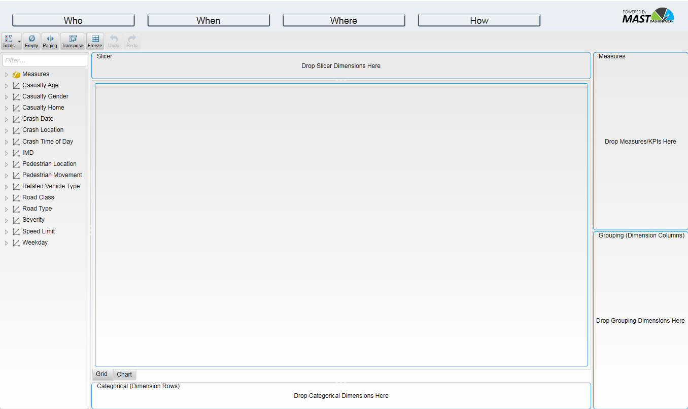
The four pages detailed above show some of the most common analysis relating to pedestrian casualties. However, if you require more detailed analysis using a range of dimensions, the cube contains cubed data similar to MAST. For those familiar with MAST the cube will be fairly self-explanatory although there are some differences. On navigating to the cube a blank report is shown, as seen in the image below.
- There are a series of dimensions on the left hand side of the page. These dimensions can be dragged on to the report. When dragging dimensions drag them on to the title of the box i.e. ‘Categorical (Dimension Rows)’.
- Dimensions can be placed in the rows box on the bottom of the page (‘Categorical (Dimension Rows)’), the columns box to the lower right of the page (‘Grouping (Dimension Columns)’), or in the slicer box to the top of the page (‘Slicer’).
- There are 2 tabs just above the rows box, where either the data grid view or the chart view can be selected.
Example:
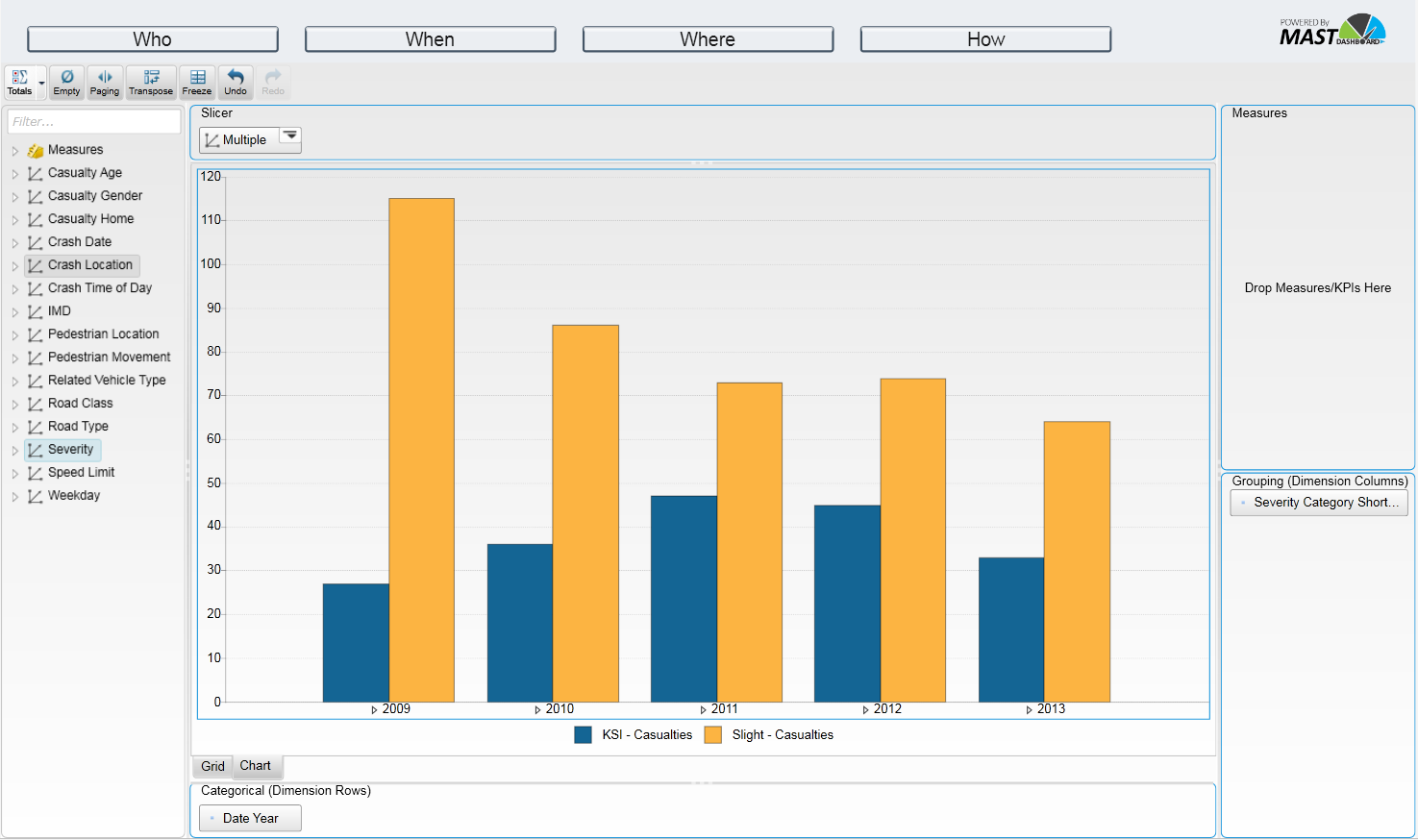
Below is an example of how to use the cube. We are going to use the dimensions in the list on the left to show child pedestrian KSI casualties in Aberdeen, by year, over the past 5 year period.
As all the casualties in this cube are pedestrian casualties we don’t need to filter be casualty class here. Firstly, we drag the dimension ‘Crash Date’ to the rows box. To filter the crash year we can either right-click on the dimension in the rows box or click on the small icon to the right of the dimension and click on ‘Edit’. Deselect all years using the icon second left at the top and select only the years 2009, 2010, 2011, 2012 and 2013.

We then drag the ‘Severity’ dimension to the columns box and ‘Crash Location’ to the slicer box. Right-click on the ‘Crash Location’ dimension, click edit, de-select all locations, select ‘U_Aberdeen’ by drilling down in to Scotland, R_Scotland, P_Grampian, G_ScotAber and checking the box next to ‘U_Aberdeen’. This produces the following table. Totals can be toggled on and off using the ‘Totals’ icon to the top left.

Clicking on the chart tab above the rows box shows the same data but as a chart.
To the top left of the page are seven icons:
![]()
The Totals icon allows the totals in the grid to be toggled on and off. By clicking on the down arrow on the right of the icon you can chose whether the totals are shown for the rows and/or columns axis.
By default only hierarchy members that have at least one value are shown in the grid. Clicking on the Empty icon shows all of the hierarchy members regardless of whether there are any related casualties.
The Paging icon changes the number of rows and/or columns that will be shown on each page. If there are more records than the number(s) entered a control will be visible to the bottom of the screen to move to the next page(s).
Transpose swaps over the row and column axes.
The Freeze icon freezes the grid/chart and will not change until the icon is unselected.
The Undo icon undoes any action in the cube and the ‘redo’ action redoes the action.